Snowball Design System
Product: Telus Health Virtual Care
Modernizing a scalable, accessible design system for web and mobile platforms.
I owned the Snowball Design System end-to-end, from system audit and research through architecture, token strategy, component standards, and documentation. I set the quality bar, defined system structure, and guided how teams adopted and scaled the system.
This case study covers the architected Snowball Design System infrastructure that scales craft, speed, and quality across TELUS Health virtual care products on web and mobile platforms. I led the restructuring of the system’s architecture, token strategy, and component library to reduce duplication, improve accessibility, and enable scalable reuse across teams. By introducing clear information architecture, token-driven styling, and governance guidelines, the system became easier to adopt, faster to use, and more reliable as a single source of truth for designers and developers.

My Role
Senior UX/UI Designer and Design System Lead
I owned the Snowball design system end-to-end, from system audit and research through architecture, component standards, and documentation. I was responsible for setting quality bars, defining system structure, and guiding how teams adopted the system, including:
-
Leading the audit and consolidation of existing components and variants
-
Creating a scalable token architecture with color, typography, spacing, and radii variables
-
Redesigning components for accessibility, consistency, and performance
-
Establishing naming conventions and organizational structure for components and tokens
-
Partnering with fellow designers to align patterns
-
Facilitating workshops to gather feedback and drive cross-team adoption
-
Documenting component usage guidelines and decision trees
-
Ensuring parity across Web, iOS, and Android
-
Collaborating with development to validate feasibility and hand-off accuracy
-
Creating a roadmap for future enhancements and governance processes
Problem Statement
What wasn't working, and why it mattered
Snowball had grown over time without a clear system foundation. Components were added as needed, but there was no consistent structure, naming, or token strategy tying everything together.
Designers often recreated components or avoided the system because it was hard to know what was approved, how patterns should be used, or how designs would scale across web and mobile. Accessibility was not built into components, and guidance was missing, which meant issues were often discovered late.
Developers faced similar challenges. Incomplete documentation, missing semantic tokens, and unclear ownership made implementation inconsistent across platforms. Teams spent more time fixing and adapting components than building new product features.
As adoption grew, these gaps increased design debt, slowed delivery, and reduced trust in the system, creating a clear need for a more structured, scalable foundation.
Current State: Where the System Was Breaking Down
SYSTEM ISSUES
-
Fragmented components
-
Confusing and inconsistent names
- Design values (colors, spacing, fonts) not reused properly
-
Limited token usage
- Limited variable usage
-
Documentation was incomplete or hard to find
-
Governance needs: No clear ownership or rules for maintaining the system
DAY-TO-DAY PROBLEMS
-
Designers had to rebuild components again and again
-
Teams weren’t sure which design pattern to use
-
Platform inconsistencies
- Designs looked and behaved differently across platforms
-
Accessibility was often fixed at the end instead of built in
RISK & OPPORTUNITY
-
The system became harder to maintain over time
-
Work took longer than it should have
-
Teams lost confidence in using the design system
-
There was a clear need to build a stronger, scalable foundation
Design Goals and Success Criteria
- Establish a clear system architecture that scales across web, iOS, and Android
- Reduce component duplication and unclear pattern usage
- Introduce a token-based foundation to support theming and accessibility
- Make components easier to find, understand, and reuse
- Improve accessibility consistency across components
- Create documentation that designers and developers could trust and follow
- Enable faster iteration without sacrificing quality or consistency
Research & Insights
What I learned by studying Snowball and other leading design systems
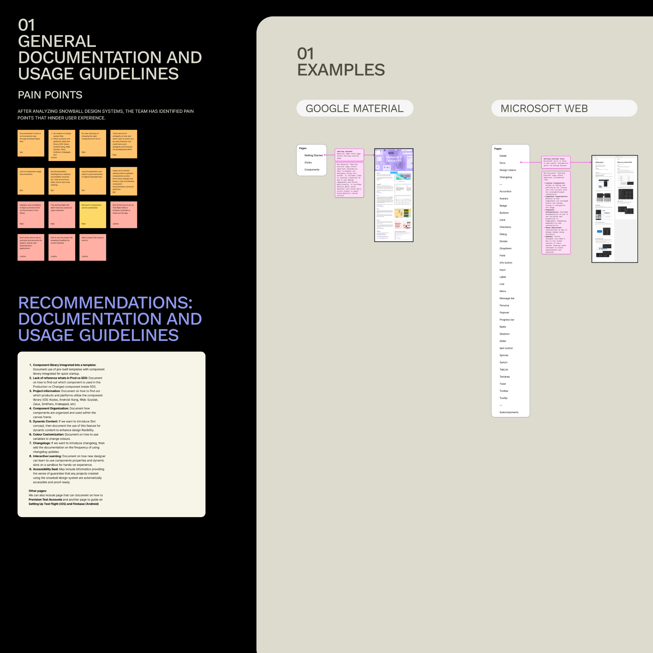
To understand where Snowball was breaking down and where it could scale, I reviewed the existing design system, analyzed usage patterns, and compared it with well-established systems such as Google Material, Microsoft, Apple HIG, Shopify Polaris, and Atlassian. The findings below highlight recurring structural issues that impacted speed, consistency, and trust in the system.
Key Research Findings
1. Documentation and usage guidance were hard to follow
In mature design systems, documentation clearly explains:
-
What a component is for
-
When to use it
-
When not to use it
In old Snowball design system:
-
Usage guidance was limited
-
Designers had to rely on guesswork
-
There were no clear do’s and don’ts components
This made it harder for new designers to adopt the system confidently.
2. Sidebar and page organization caused navigation friction
When reviewing other design systems, a common pattern emerged:
-
Each component has a clear, predictable place
-
Navigation feels intentional and easy to scan
In the old Snowball design system:
-
Components were grouped together across pages
-
Finding a specific component required prior knowledge
This slowed down everyday work and increased cognitive load.
3. Canvas content was dense and difficult to scan
Leading systems organize component pages so that:
-
Variants, states, and examples are easy to compare
-
Content is visually structured and readable
In old Snowball design system:
-
Canvases were crowded
-
Related information was spread across large areas
-
It was difficult to quickly understand how a component behaved
This made learning and reusing components harder than necessary.
4. Components lacked clear usage boundaries
From the research, it was clear that strong systems:
-
Explain when to choose one component over another
-
Provide guidance for common scenarios
In old Snowball design system:
-
Multiple components existed for similar use cases
-
There was no clear guidance on which option to choose
-
Designers often created custom solutions instead of reusing patterns
This led to inconsistency across products.
5. No clear process for component updates and changes
Other systems clearly document:
-
How components evolve
-
What has changed
-
How teams should adopt updates
In Snowball:
-
Changes were not consistently documented
-
Designers and developers were often unsure what was new or approved
-
This reduced trust in the system over time
6. Missing foundations limited scalability
The research also highlighted foundational gaps:
-
No semantic token layer existed
-
Primitive tokens were incomplete and inconsistently used
-
Accessibility was not built into components or documentation
-
Newer Figma capabilities (variables, modes, structured styles) were not leveraged
These gaps made it difficult to scale the system across platforms, themes, and teams.
Taken together, these findings showed that Snowball’s challenges were not visual, but structural. The system lacked clear foundations, guidance, and governance, making it difficult for teams to move quickly while maintaining quality and consistency.
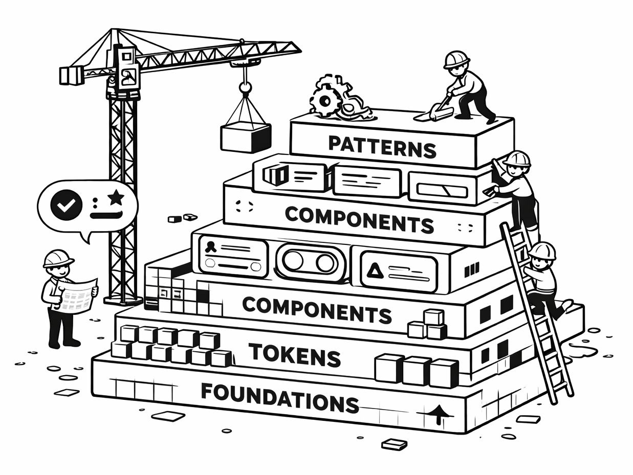
System Architecture
The Snowball Design System was re-architected as a layered system, where each layer has a clear purpose and responsibility. This structure makes the system easier to understand, adopt, and scale across teams, platforms, and products.
Rather than treating components as isolated assets, the system was designed as an ecosystem, built on shared foundations, powered by tokens, and governed by clear usage and update rules.
The foundation layer establishes the base design decisions that everything else builds on. This included:
-
Clear typography structures created separately for Web, iOS, and Android
-
Standardized spacing, sizing, and layout principles
-
Platform-specific considerations to respect native behaviors and conventions
Separating foundations by platform reduced ambiguity and ensured designs felt native while remaining consistent.
A multi-layer token strategy was introduced to enable consistency, flexibility, and scalability. The system now uses:
-
Primitive tokens for raw values (color, spacing, typography)
-
Semantic tokens to express meaning (e.g., success, error, surface, text)
-
Component-specific tokens to control behavior and appearance at the component level
-
Mapped tokens to connect design decisions across themes and platforms
This structure allows global changes (such as theming or accessibility updates) without redesigning individual components.
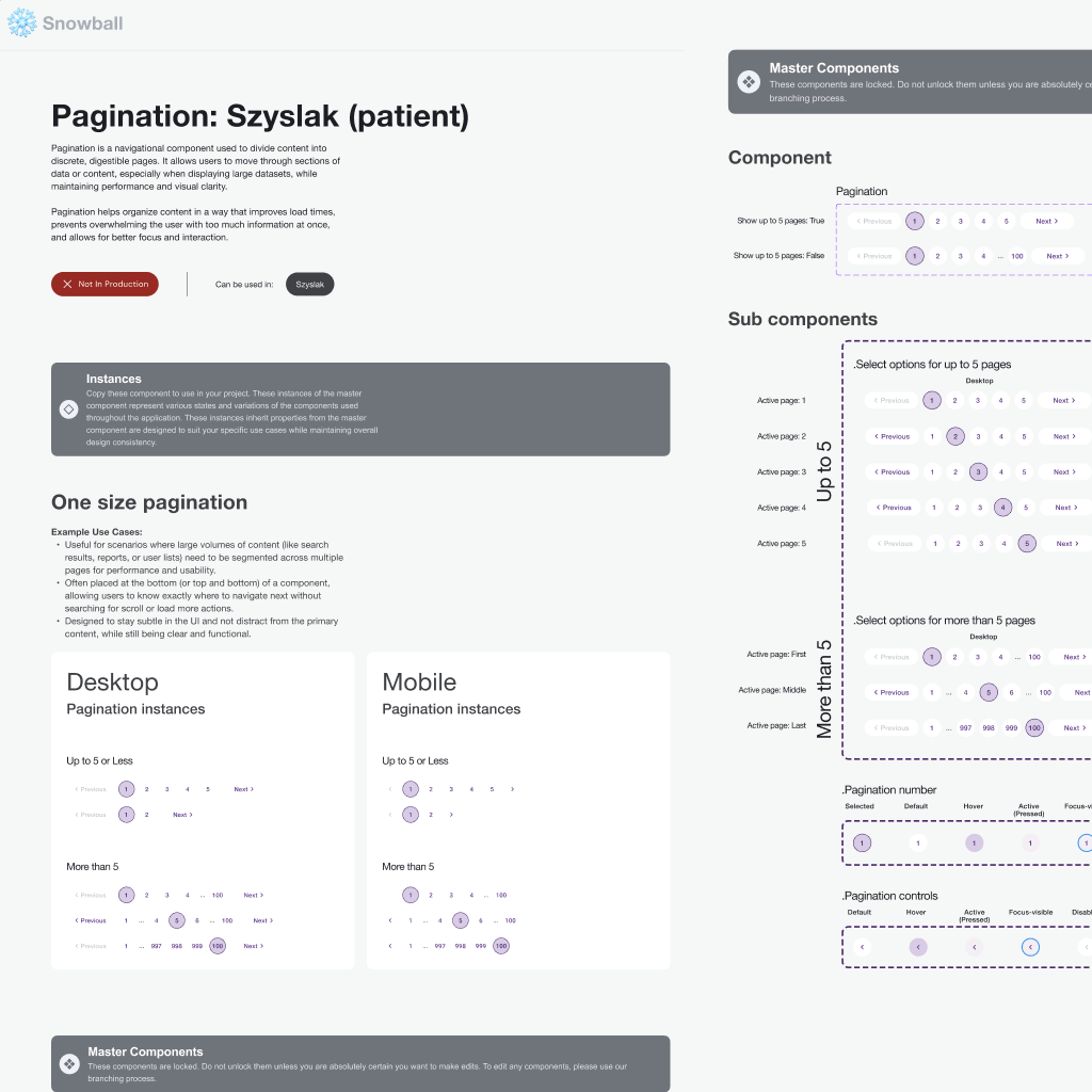
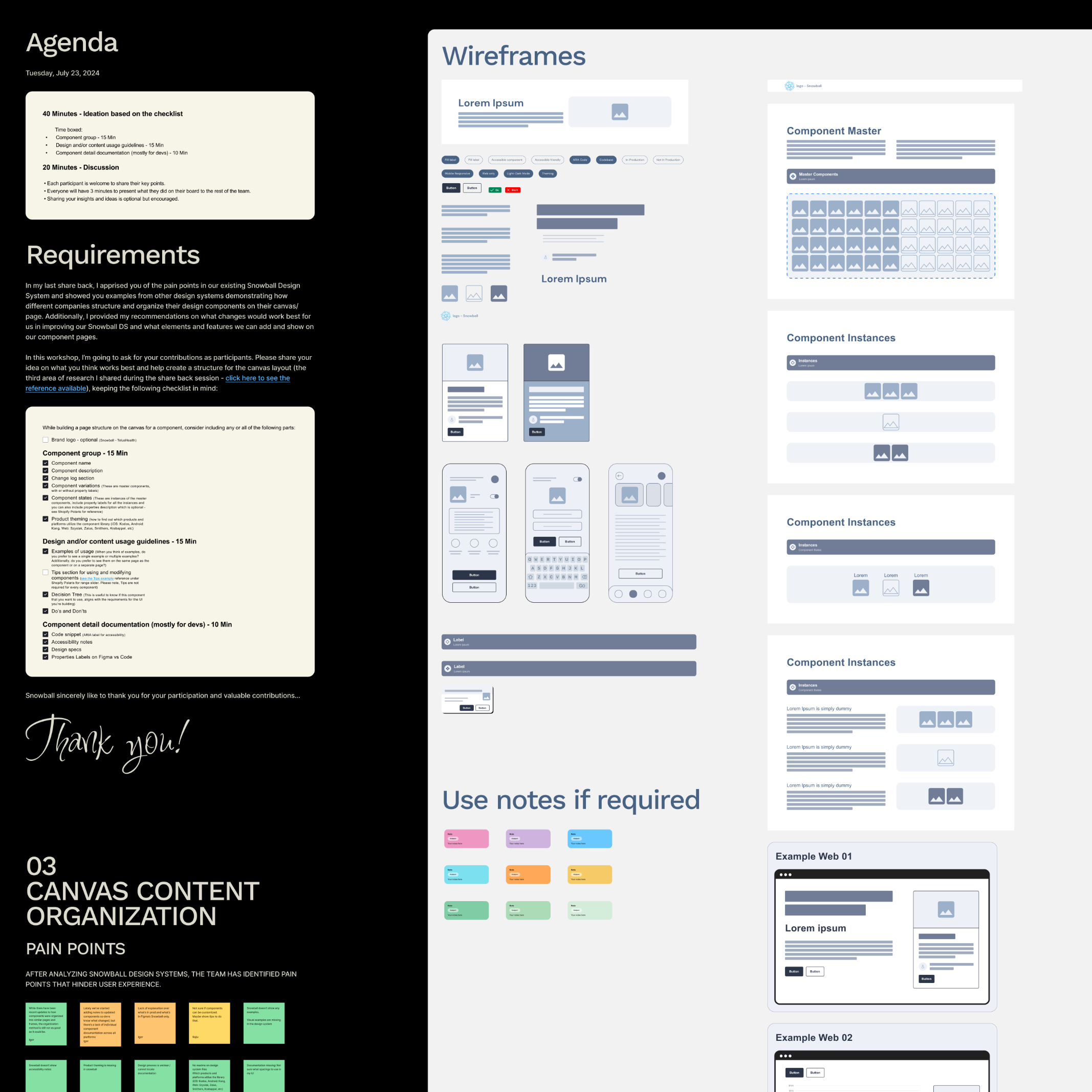
Components were reorganized so that:
-
Each component lives on its own dedicated page
-
Variants, states, and behaviors are grouped logically
-
Related components follow consistent naming and structure patterns
This made components easier to find, compare, and reuse, reducing duplication and guesswork.
Beyond individual components, the system documents:
-
When to use one component over another
-
Common scenarios and edge cases
-
Do’s and don’ts for consistent application
Decision trees and examples were added to guide designers toward the right choices, especially in complex or ambiguous situations.
To support long-term adoption, the system introduced:
-
Clear documentation standards
-
Guidance on component changes and updates
-
Shared understanding of what is approved, experimental, or deprecated
This helped rebuild trust in the system and made ongoing evolution more predictable for both designers and developers.
Component Changes & Examples
Once the core structure of the design system was in place, the next step was to update the main components so they all followed the same rules. Each component was reviewed and cleaned up to remove duplicates, make its purpose clearer, and ensure it worked consistently across Web, iOS, and Android.
The updates focused on making components easier to understand, easier to find, and easier to reuse. This included improving names, organizing states more clearly, and adding better documentation. Instead of fixing components one by one, changes were made in a way that strengthened the entire system, helping teams build more consistent, accessible, and scalable designs over time
NEW DESIGN
1. Token Architecture
- Introduced a complete variable token system, including:
- Primitive tokens
- Semantic tokens
- Component-specific tokens
- Mapped tokens
- Tokens are reusable, scalable, and ready for theming and platform parity.
- This helped remove guesswork from design decisions. Instead of designers manually choosing colours, spacing, or typography, the system encoded intent into tokens, making consistency the default rather than an extra step.
2. Platform-Specific Typography Structure
- Created separate typography structures for:
- Web
- Android
- iOS
- Font styles are clearly defined, scalable, and aligned to platform guidelines.
- This respected platform conventions while keeping visual consistency at the system level.
3. Clear Component-Per-Page Structure
- Each component lives on its own dedicated page
- Example: Buttons, Cards, Inputs, etc.
- Pages are easier to find, scan, and maintain.
- Improves discoverability for both designers and developers.
4. Structured Component Documentation
- Components are organized with:
- Clear variants and states
- Visual hierarchy
- Inline guidance and callouts
-
Easier to understand expected usage and behavior.
5. Scalability & Maintenance
- Designed with scale in mind:
- Tokens support future themes and updates
- Clear structure supports long-term maintenance
- Reduced need for component duplication

OLD DESIGN
1. No Token Strategy
-
-
- No semantic token layer existed
- Token usage was inconsistent and incomplete
- Styling decisions were often hard-coded at the component level
-
2. Flat Styles
-
Typography styles were mixed together
-
No clear separation between Web, Android, and iOS
-
Difficult to scale or update typography consistently across platforms
3. Grouped Pages
-
Multiple components were grouped together across shared pages
-
Harder to locate a specific component
-
Increased cognitive load and maintenance effort
4. Scattered Information
-
Component information was scattered across large canvases
-
Variants and states were harder to compare
-
Documentation depth varied significantly
5. Growing Design Debt
- Structure did not support growth
- Teams spent time fixing components
- Increased risk of design drift over time
Tools Used
-
Figma (Variables, Components, Tokens, Libraries, Auto Layout 5)
-
FigJam (Workshops, IA mapping, system flows)
-
Notion (Documentation, guidelines, audit trackers)
-
Slack (Team collaboration & async reviews)
Outcome and Impact
Designers could more easily:
-
Find the right component
-
Understand when and how to use it
-
Trust that patterns were intentional and up to date
This reduced time spent recreating components or making ad-hoc decisions.
By separating foundations and respecting platform conventions:
-
Web, iOS, and Android designs felt more native
-
Visual and interaction inconsistencies were reduced
-
Cross-platform scaling became more predictable
The new token architecture:
-
Enabled faster theming and updates
-
Reduced the impact of design changes
-
Made accessibility improvements easier to apply consistently
Clear documentation, usage guidance, and structure helped:
-
Reduce uncertainty around approved components
-
Align designers and developers
-
Position Snowball as a reliable source of truth rather than a reference library
While the system uplift was ongoing, the architectural changes laid the groundwork for:
-
Easier onboarding of new designers
-
More efficient collaboration with engineering
-
Sustainable system growth without sacrificing quality